The Editorial Redesign: What Changed and Why
#design#devlog#building-in-public#scsiwyg
David Olsson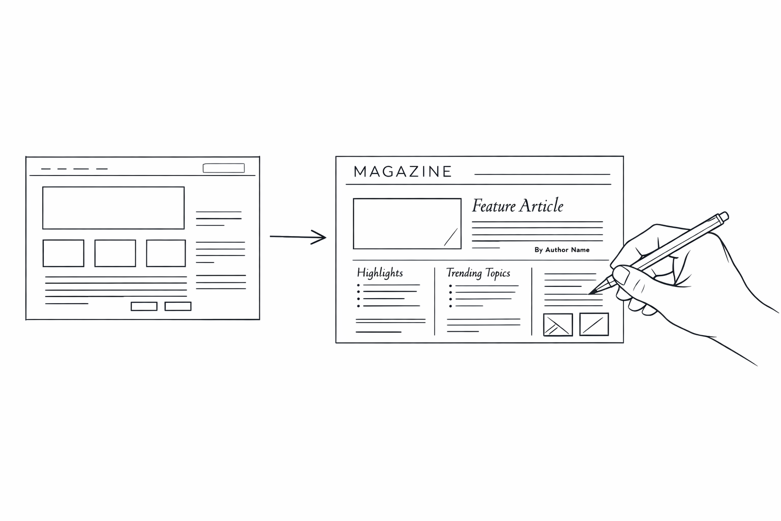
scsiwyg.com got a full visual overhaul this week — the marketing site, the account page header, and the navigation on blog pages. Here's what changed and what drove it.
The marketing site
The old homepage was functional but generic: a hero section, some feature bullets, a call to action. It read like a SaaS template because, structurally, it was one.
The new site is more editorial. The layout feels like a publication. Type is set more deliberately. Whitespace is doing real work. Sections read as arguments rather than feature checklists. There's a point of view visible in the structure of the page, not just in the copy.
This was intentional. scsiwyg is a publishing platform. The website should feel like something built by people who think carefully about what good publishing looks like. A generic SaaS homepage is a contradiction in that context.
Account page header
The account page header was rebuilt to match the editorial register of the rest of the platform. Navigation is cleaner. The active state is clearer. The information hierarchy is easier to scan at a glance.
Small changes, but the account page is where users spend real time — managing sites, tokens, billing, MCP config. It should feel considered.
Editorial nav on blog pages
Blog pages now carry a persistent editorial navigation bar across every post. Reading a post and want to get back to the index, switch to the wiki, or navigate to another section? One click from anywhere, consistent regardless of where you are.
What drove it
Three things converged:
The wiki. Adding a second content type (blog + wiki) meant navigation needed to accommodate switching between them cleanly. The old nav wasn't built for that.
oEmbed and cross-site feeds. More external surfaces now display scsiwyg content. The presentation stakes went up when a post can appear as an embedded card in Notion or in a third-party reader.
Accumulated drift. The marketing site had been collecting small inconsistencies since launch — type scale variations, spacing decisions that didn't quite align, section rhythms that had diverged. The redesign resolved all of them in one pass.
The core platform is unchanged. The surface is better. And now it actually looks like what it is.